Blog search
Artists
- Aara
- Akhlys
- Anfauglir
- Archgoat
- Arkona
- Aversio Humanitatis
- Behexen
- Beneath Moonlight
- Blood Abscission
- Blut Aus Nord
- Bong-Ra
- Cailleach Calling
- Eitrin
- Ershetu
- Godkiller
- I.C.E.
- Inferno
- Insect Ark
- Kaleikr
- Light Of The Morning Star
- Miserere Luminis
- Modern Rites
- Mütterlein
- Óreiða
- Other World
- Pestifer
- Pestilength
- Pestilent Hex
- Plebeian Grandstand
- Pure Wrath
- Selbst
- Servants Of Chaos Festival
- Slidhr
- Sühnopfer
- Taubrą
- The Lovecraft Sextet
- Throane
- Ulcerate
- Waidelotte
- White Ward

LE 7E OEIL - Interview with Linus
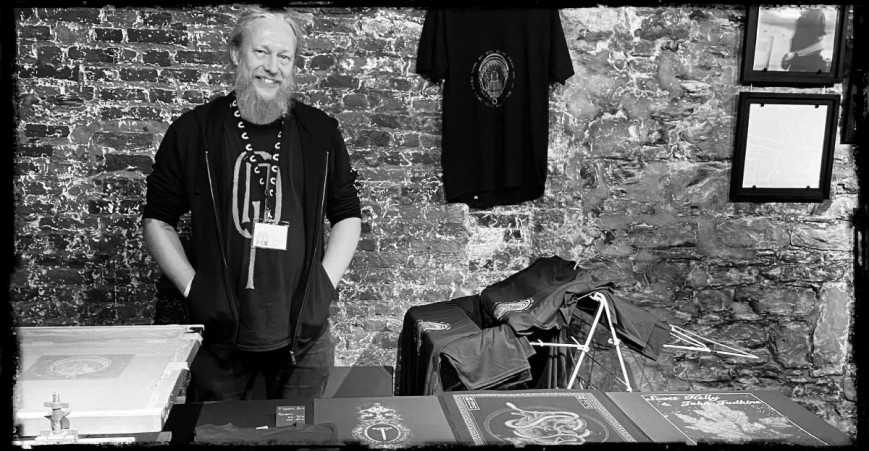
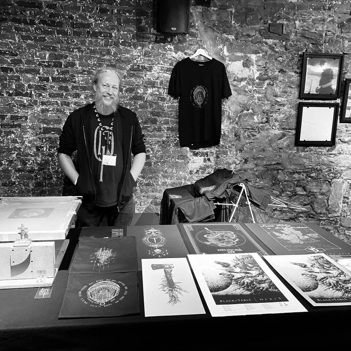
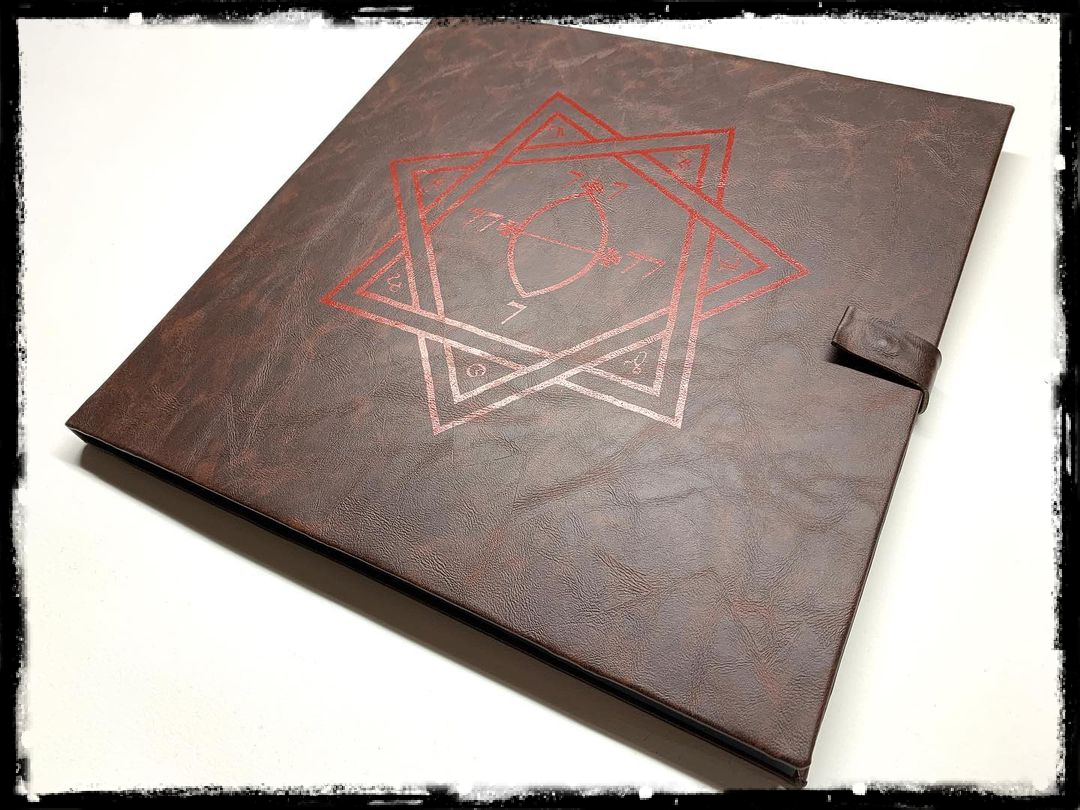
Lionel "Linus" Arlen, the artist behind Le 7e Oeil, has been and is a vital part when it comes to the visual design and special editions of countless DMP releases. Be it the "grimoire" edition of the latest DØDSENGEL long player, the box set of WHITE WARD's "False Light" album or the slipcase of BLUT AUS NORD's "Ultima Thulée" – the craftmanship of Le 7e Oeil ennobled all these musical works of Art. In an interview with us, Linus narrates about his screen-printing techniques, the collaboration with artists and DMP as well as about his different sources of inspiration and artistic backgrounds.

Photo: Désirée Hanssen (Lay Bare Recordings)
Q: Hey Linus, thank you very much for your time. Could you elaborate for us the beginnings of Le 7e Oeil? Is there something like a "first product" which set everything into motion?
As far as I can remember – it really is a classic answer – I think that I have drawn since the very beginning of my life. Indeed, as a child I always had a pencil or brush in my hand… If we had to give a precise date concerning the first artworks related to music that I realized, it would correspond to my college period. During that time, the music was essentially available in CD and K7 format. All my friends and me, since not everyone could buy all the albums, exchanged them and made copies of the CDs on K7. From that day onwards, I started to "recreate" the covers on the K7 jackets. It often took a long time and was laborious, but so exciting, haha! Then, in high school, I started making original artwork for various music groups of friends at the time. I think it all started then.
Regarding screen printing, this practice arrived much later, about 10 years ago. It was a bit like a hazardous coincidence: A band from our region and I had the idea of making a handcrafted LP cover in screen printing. For that we had the help of a friend who is a actual screen printer. But he did not have the necessary time to finalize all the copies, so he simply said to me: "You seem to like it. I'll lend you two hinges, a screen and some ink, you will finish them at home…". This challenge as well as the precarious installation reminiscent of the Punk days and a few printing tests convinced me… The adventure began!
The name Le 7e Oeil ("The 7th Eye") was originally the name of a video creation collective set up I had with a friend of mine. We produced clips for musical groups in our region. At the end of this adventure, I decided to keep the name for all my artistic and graphic creations.
Q: The number 7, according to religious traditions, is the combination of 4 (soul/spirit) and 3 (body), thus representing the human being. You mentioned that the number 7 is important to you due to its symbolic value. Can you comment on this further?
Even if I am not in any religious movement and keep myself as far away as possible from any religious doctrine, the symbolism of the number 7, as a combination of the numbers 4 (spirit) and 3 (body), seems very adequate to me. All craftsmanship and Art, in my opinion, starts from this principle. While utilizing one's body, one seeks the means and the medium to give form to an idea, an emotion or a sensation initiated by one's mind. All my creations start from an emotion which I try to translate into a physical, material object.
Q: You studied architecture. In how far did you learn helpful skills from these studies that you can also apply to your work with Le 7e Oeil?
Architecture and Design Studies have certainly played a very important role in the way I can approach screen printing today. I practiced this activity as an architect for 20 years before devoting myself fully to screen printing for various reasons. The process of realizing an architectural project is essentially identical to that of creating a vinyl cover. Only the scale of achievement differs. As stated above, the act of creation is the combination of the action of body and mind to achieve a concrete object. A way of thinking…
Q: A lot of your work is done almost 100 % by hand and, therefore, it is unique and special. What role does tangibility play in your Art?
This tangible experience is totally linked to what I describe concerning the creative process. In my opinion, and I have held this belief since the very beginnings of when I discovered the musical world, an album is a whole. It is not limited to the music present on the album. For me, the visual aspect is inseparably linked to the auditive aspect. There is a feeling of understanding when observing the complete packaging. Having a tangible experience, both auditory and visual, even tactile and sensitive, is important to me. The graphics as well as the materiality of the cover are inseparable elements of the music.
During my childhood, I remember spending long hours listening to albums as well as "dissecting" and analyzing the covers. There has always been this need to touch, to feel. The search for materiality is, undoubtedly, connected to architecture in a specific sense.
The advantage of screen printing, unlike digital/offset printing, lies in the fact that by depositing a significant thickness of ink on the paper, it leaves a more durable and consistent mark. In addition, with this method, you can play with material and texture.
Q: When browsing through your oeuvre, one notices that you have worked with a lot of different artists, different materials, and different products – from rather traditional posters to special cushions to hand-crafted slipcases for LPs and CDs and so forth. To me it seems that you must adjust yourself all the time to rather different conditions and circumstances. Is that correct?
Each creation always remains an inner struggle, haha! It is true that the multiplicity of supports (paper, fabric, wood, PVC, et cetera) brings complexity to each project. But my way of printing always remains the same – apart from the needs for adaptation of ink and additives according to the support material. I really like working with different media, different ink properties (classic matte or satin ink, phosphorescent, heat-reactive, etc.). To move from one material to another allows you to never rest on your achievements and above all, to experiment, to find new paths to explore. This part of doing research for any design is paradoxically perhaps the most interesting and exhalating "moment" of the creative process.
Q: When asked what kind of style you personally like artistically, you once noted: "sobriety and a certain romanticism". Could you elaborate for us what that exactly means?
In my opinion, the period of Romanticism, influenced by the Baroque, embodies a form of rebellion against the classical and academic dogma of the time, centered on the dominance of sensitivity, emotion, and imagination over reason and moral. The strong themes put forward in this artistic movement seem to have always touched me a lot: melancholy, the fantastic atmosphere, death, daydreaming, et cetera.

"Grimoire" edition of DØDSENGEL's "Bab Al On"
Q: When it comes to your work for the releases on DMP, you are often working as a triptych, namely Phil, Dehn Sora, and yourself. Can you tell us how the communication works between the three of you? Does every individual have a specific "role" in this process?
I guess that "friendship" is the correct word. This tripartite collaboration has always been, and I hope it will remain so for a long time, a real pleasure. The secret undoubtedly lies in the fact that the triptych has a spirit, a common vision. Each personality has a specific role in the process: Phil, as the initiator and artistic director of the project, provides the "specifications" and validates the choices throughout the design. He is also the link between the musical artist and the graphic artists/craftsmen. Dehn Sora, as a graphic designer, brings the general aesthetic idea and graphic formatting with the immense talent he possesses. I must admit that it is always with great pleasure that I print his works, which are also often a challenge when it comes to the light/darkness of his drawings, haha! L7O, as a craftsman, offers a physical formatting of the product and tries to translate the graphics into a reproducible object through screen printing, taking into account the method of implementation according to the chosen support material. All these steps generate several feedback trips during the process, which – let's face it – generally go smoothly and are to the benefit of the final form.
Q: The musicians themselves are, of course, also involved when creating a product for their work of Art. Is it usually a long process of talking to the artists to figure out what they would wish for their music?
Regarding DMP, Phil realizes a good part of it upstream of the project and brings a precise idea of the final graphics. For artists outside of the DMP universe, it really depends on the people, but generally the exchange of ideas is quite fast and effective. There have, of course, been some projects in which the ideas of the group were not feasible, either due to the desired materials or a graphic design which is not suitable for screen printing and its constraints. The biggest challenges experienced were essentially ultra-realistic photos or multi-layered artworks. However, the biggest challenges are also the most motivating projects. In general, there have been very few projects that were totally unachievable. We always find a solution, an adaptation that makes the project viable.
Q: In the video below, we can see you working on the BLUT AUS NORD re-release of "Ultima Thulée". Could you describe for us the process how the concrete visualization of this release came into being?
For the "Ultima Thulée" project, the basic idea was a slipcase with die-cuts revealing certain parts of the original cover. The slipcase graphics were created by Quentin Régnier. My part was, therefore, to translate these data and adapt the implementation on cardboard. Each slipcase was first cut to create the necessary die-cuts, then printed color by color. Then comes the pre-folding and finally the shaping of the slipcase. Regarding the overall production time, we can estimate this at two or three weeks for the LP versions and approximate a big week and half for the CD versions.
Q: For the various editions of DMP releases, you used different materials. Which material was the hardest to work with and why?
The most complex material to use was rigid PVC. The first time I used it was for a project with CHAOS ECHOES. The difficulty of this support material was twofold: finding a suitable ink that is stable over time and defining the way to shape and fold it without breaking it. It took countless trials and failures before finding THE right solution. In addition, this particular project contained a mixture of three colors, printed on the outside, but also on the inside of the case in order to play with the transparencies. So, we can say that it is certainly the project that gave me the most complex moments of research.
There are no materials that I really exclude, but some, such as glass, pose major shipping concerns due to its fragility. And others, such as wood, for example, make it difficult for projects to hold on the agreed financial plan because of production costs. For all projects there is a balance to be found between complexity, feasibility and cost. And that's the beauty of being able to work on it from beginning to end.
Q: To conclude this question - is there also something like your most favorite material to work with?
This indeed follows the previous answer. Despite the enormous difficulties encountered with PVC, it is a material with which I really like to work because of the various possibilities it offers (layering of colors, transparency, light effects, et cetera).
Q: Can you, as the last question, allow us a little sneak peek into your "workshop/factory"? What does the place look like in which you conceptualize and then create these products?
I feel lucky to be able to work from home, having enough space to set up a workshop totally dedicated to screen printing. As a result, I can work alongside my children, which greatly facilitates the combination of family and professional life. This situation, with all the advantages it brings, also brings some inconveniences, such as never knowing to stop, haha! Regarding the machines, there is obviously the printing table which remains at the center of all creation, alongside with all small materials as pens, cutter, cutting rulers, et cetera.
Posted on 04-01-2023
No products
To be determined Shipping
0,00 € Total