Blog search
Artists
- Aara
- Akhlys
- Anfauglir
- Archgoat
- Arkona
- Aversio Humanitatis
- Behexen
- Beneath Moonlight
- Blood Abscission
- Blut Aus Nord
- Bong-Ra
- Cailleach Calling
- Eitrin
- Ershetu
- Godkiller
- I.C.E.
- Inferno
- Insect Ark
- Kaleikr
- Light Of The Morning Star
- Miserere Luminis
- Modern Rites
- Mütterlein
- Óreiða
- Other World
- Pestifer
- Pestilength
- Pestilent Hex
- Plebeian Grandstand
- Pure Wrath
- Selbst
- Servants Of Chaos Festival
- Slidhr
- Sühnopfer
- Taubrą
- The Lovecraft Sextet
- Throane
- Ulcerate
- Waidelotte
- White Ward
BLUT AUS NORD - Interview with Maciej Kamuda
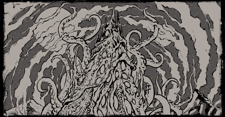
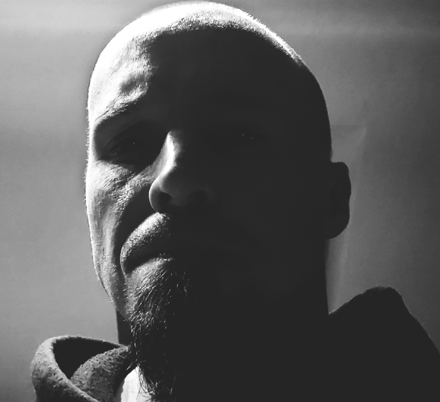
On "Disharmonium – Undreamable Abysses", Vindsval (BLUT AUS NORD, FORHIST, YERÛŠELEM) collaborated with Maciej Kamuda for the cover artwork. The Polish graphic artist already left his mark on underground releases like DEIVOS' "Casus Belli" as well as WITCHFINDER's "Hazy Rites", but this is the first time he created an artwork for BLUT AUS NORD. For this task, Maciej immersed himself into the cosmos of Lovecraftian horror as well as into the sinister soundscapes of Vindsval's Art. In the interview with us, he narrates about the process of creation, the communication with Vindsval and his education at the Academy of Fine Arts.
Q: Hey, Maciej! This is the first time you worked together with Vindsval to give visual form to one of his musical visions. Could you tell us how you got into contact with him and how the process developed?
Actually, it was Phil from Debemur Morti Productions who reached out to me and asked if I was willing to work on the cover of a new BLUT AUS NORD release. I was in touch with Phil for some time then, so I am guessing it was him who suggested my name to Vindsval. I agreed without even thinking much as I love BAN's music. Let's just say: it was an offer I could not refuse. Right after that Vindsval mailed me, gave me a brief update of the whole concept behind the album, and that is how it started.
Q: Did you already know Vindsval's Art he creates with BLUT AUS NORD, YERÛŠELEM, FORHIST and so forth? Did you have a concrete idea of what awaits you musically and also conceptually?
Yeah, BLUT AUS NORD is not an unknown name to me. When you are into Black Metal, you just cannot ignore that band, regardless if you like them or not. It just so happens that I love their music. "Hallucinogen" was one of my favorite albums of 2019, so I had an idea what to expect, more or less. I know FORHIST. I have heard the debut and I think it is great. As for YERÛŠELEM, I have to admit, I wasn't really familiar with that project. I heard just a couple of songs, not enough to call myself an expert. Anyway, I knew Vindsval's work, especially BLUT AUS NORD, so I was ready.
Q: How did you prepare to create the artwork for "Disharmonium – Undreamable Abysses" and how do you in general prepare for creating artworks for different bands?
Well, first of all, usually I need to talk to the band about the general idea behind the album's concept. This connection with the client is necessary. You need to understand each other. I also ask if it is possible to hear some music, even if the songs are raw and unmixed. That what happened here with "Disharmonium – Undreamable Abysses". Vindsval sent me some rough and unmixed instrumentals so I could get the idea, the feeling, the mood. This is important, at least to me. Sometimes it is even more important than the conceptual briefing itself. Once I know the direction and feel the music, meaning I was able to get into the album's atmosphere, I start working on sketches. When I was working on the artworks for this album, I listened to those rough samples and instrumentals pretty much all the time. It helped me to stay focused on my goal.
Q: What information and what task did you receive from Vindsval? Did he already have a clear picture in his mind how the cover artwork should look like?
I love to have artistic freedom for an interpretation. I am an artist myself, not a machine, I need to have that freedom of creation so I can put my name under the artwork. And this is where Vindsval and me connected. He gave me some rough concept of the album, explained the whole idea behind it, but he never told me what exactly I should do. He trusted me and had faith in my interpretation. When he told me that "Disharmonium – Undreamable Abysses" would be like a continuation of "Hallucinogen" but much darker and twisted, more obscure and disturbing, at that point, I knew what to do.
Slipcase: digital sketch in its final stage
Q: Was there something specific that was especially important toVindsval concerning this cover artwork?
Actually, Vindsval told me that they were looking for something psychedelic, horrific, obscure, cosmic and Lovecraftian. These are exactly his words. He wanted the artwork to represent the disturbing exploration of dark soundscapes. He wanted me to pay special attention to the psychedelic vibe, that was very important, that was the key.
Q: As we can see from the two different cover artworks (slipcase, main cover), you did various sketches for this release. Can you tell us more about this?
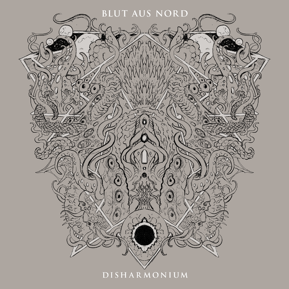
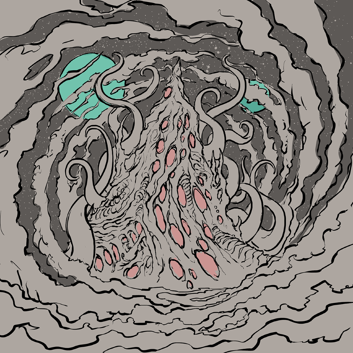
That was funny because we actually wanted to do just one artwork for the cover, and that's it. I prepared like eight sketches and Vindsval loved them all, so he couldn't really decide. These sketches were rough and simple, just to show the ideas. Vindsval talked to Phil, and finally they decided to go with two artworks, one of which would be used on the slipcase. At that point, I prepared the final sketches of both artworks and Vindsval was happy with the results. So, he gave me a green light to go further with it. It went smoothly, no complaining, no questions asked, I could just do my thing.
Q: Were there also some compromises to make, some moments when Vindsval and you did not agree on parts of the sketches?
No, not at all. We understood each other very well, and Vindsval gave me all the freedom I needed. There wasn't even a single point where we didn't connect. Even I was surprised with that because usually bands like to change some things in sketches or my concepts and sometimes they even change a lot, so it ends up with disagreements and me being pissed off, haha! But not in this case. I also think that Vindsval foreknew that trusting my creative thinking would result in the best artworks he could get from me.
Q: What were the greatest challenges concerning the cover artwork for this specific album?
Finding the right atmosphere and vibe that would complement the music. That is always the hardest part. The cover has to represent the music, so sometimes you need to struggle a lot to catch that and give the proper visualization of what the album is about. I wanted my artwork to fully match what Vindsval created.
Q: When you sit down to start creating an artwork, how may we imagine this process? Do you have – from the very beginning – already a whole picture in your head and immediately start drawing?
Let's just say there is no rule or any routine. Sometimes I know exactly what I want to do, and I am so sure of my idea that I don't need to do more than one or two sketches. Sometimes I have just a glimpse of an idea and I play around with it by sketching. And sometimes I have absolutely no fucking clue what to do, so I start doodling on paper and eventually ideas come up, haha! In this case, with "Disharmonium – Undreamable Abysses", I had lots of ideas. I started to do some simple, rough drawings in my sketchbook, just to catch all the thoughts flowing and running through my mind and once I had all that on paper I started to work on sketches. That's why there were eight of them!
You know, I use to say: when you are creating an art, there is a certain point when the artwork starts to live on its own. The artist's job is to respond to that and try not to lose control on the process. That happens every time!
Main cover: digital sketch in its final stage
Q: Could you tell which material and which method of drawing/painting was used this time for "Disharmonium – Undreamable Abysses"? Is that your typical method and are those the typical materials you utilize when creating artworks?
Again: no rules, no routines! I always do what I feel is best for the artwork. In this case I did the very first sketches traditionally on paper, in my sketchbook. I scanned them and prepared some slightly revised, but still rough digital sketches. Both final artworks were drawn digitally. I draw digitally the same way I draw traditionally, so no tricks, no bullshit, no photo bashing, no 'how to do an artwork in Photoshop in 5 easy steps' and shit. I do it old school, I draw from scratch. It does not matter if it is on paper or tablet. The advantage of drawing digitally is that you skip the scanning part, so you don't have to waste your time on clearing the scanned drawing, preparing it, et cetera. This is helpful when you work with deadlines. Also, coloring digitally grants the ability to change the color scheme or particular colors with ease. You can play around with colors faster, as much as you want and find the best palette. The "Disharmonium – Undreamable Abysses" cover had like thirteen color versions. That was another tough decision Vindsval had to make, haha!
Q: Is there a specific symbolic, rather than "just" an aesthetic reason behind the picture and also the used colors, for example? Are there some hidden messages in the cover artwork that want to be found?
In this case, the colors had to bring out that psychedelic vibe, that was the point. They also connect with "Hallucinogen" a bit, so there is that little reference, I think. It's not really about hidden messages or symbols here, it's more about the atmosphere. It is more of a feeling than about a calculated message, you know? I just let the music form my thoughts, and that's how I brought those images to life. I think it works the same with the music on "Disharmonium – Undreamable Abysses". You just let the music control you, close your eyes and fall deep into the abyss.
Q: The album artwork is obviously inspired by the Art of H.P. Lovecraft. Were you yourself a reader and fan of his works before you crafted this artwork?
Well, Vindsval said 'Lovecraftian', haha! I do know Lovecraft's work. I actually know it very well. I think Lovecraft is a huge inspiration for me, you will probably find a lot of Lovecraftian elements in my Art. I think it's the best horror you can find. By the way, one of my favorite stories is "The Music of Erich Zann". That atmosphere is just unmatched!
Q: You got a degree from the Academy of Fine Arts in Cracow, Poland. Can you elaborate for us what you learned during these studies?
I studied traditional graphics, you know, copperplate engravings, etching, et cetera. Old school Albrecht Dürer stuff, haha! I used to paint with oils, mostly during my studies, but I am more into drawing than painting. I love black and white. It absolutely doesn't mean I hate colors; I love them, but black and white is my thing, that is where I come from.
In Art academy you do it all: you draw, you paint, you learn theory, philosophy, all that stuff. The studies helped me to better understand what I am doing and how to control the process. I am not going to say everything that happened to me in Art academy was important, that would be a lie. I could write a whole damn book about how a lot of things there were a fucking waste of time. Nevertheless, I still learned a lot, especially from those who respected me and understood who I am.
I think that when you do Art and you are serious about it, it is important to know the theory, history and philosophy behind it. It really helps, it affects the way you work and how you understand it. You know, for example, studying the works of the Old Masters is always a great exercise from which you can benefit. As an artist, you have to evolve all the time, you can't just stay in one place and do same shit all the time, make the same mistakes all over again. You want to work on your skills, you want your every next artwork to be better, you set some goals, you reach them, you set new goals, et cetera. So, you learn from others, you learn from great painters and artists history brought forth, you learn theories and philosophies, you try new things. Sometimes I see artists, especially in the music industry, they have been working for like twenty or thirty years or so and their skills are on the same fucking level as they were in the past. They make the same mistakes regarding the anatomy, perspective etc. How the fuck is this even possible? I am not saying that I am great. I am not, there are millions of better artists than me. There is still a lot I have to learn, I know that. Art is basically learning all the time and evolving. But I understand that, I know that, I am aware of that, you know? I believe that as long as I have that awareness, I will be going forward. If you like the place you are in, if that suits you and you are happy with that and you just want to stay there as an artist, then it is ok, I guess. But I just think you are lazy. Your Art also evolves with you, how you become the man you are and how your point of view and the way you see the world changes. Your Art is the truth about who you are.
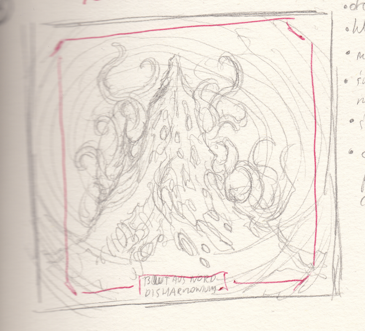
Main cover: raw first pencil sketch
Q: To dig a bit deeper: when you studied at the Academy of Fine Arts, were you already so devoted to creating visual Art for various Metal bands?
I always wanted to work in music industry, doing covers, t-shirt designs, all that stuff. I am passionate about music and about Art, so I am happy as hell that I can do what I love. Sometimes it is a love/hate kind of relationship, but I would not change it for anything. It is the result of my hard work throughout the years, and I am not slowing down. Drawing is what I do best, so I don't really have any other options, haha! As for the music, I started listening to metal when I was 8 or 9. I am 35 now, and I'm still headbanging! Art academy had nothing to do with it, I knew exactly where I am going and what I am going for. Actually, I did a few music related projects for my studies. I remember I did a whole presentation about music album covers, focusing especially on Metal. That was a pretty bold move as all the other students were doing the same shit about Van Gogh or Kandinsky, which was quite boring, haha! My professor happened to be a KING CRIMSON and BLACK SABBATH fan, so we got into a nice and long discussion. Other students were so pissed at the whole situation because they wasted so much time on preparing their presentations and I just came there with a bunch of CDs and a passion for music and Art. Listen kids, be yourselves, do not act, it pays off!
The most important insight I learned was that you are not an artist. Work hard. Always work hard and be yourself, maybe then you will eventually become one. Hell, even I don't consider myself an artist because it's not really me to decide. I don't feel like one. I use that word, 'artist' (I even said before that I am an artist myself), because it is easier to describe what I do. But I don't pay much attention to it. I just don't want to use words like 'illustrator' or 'drawer' all the time. You know, I think time will eventually tell if I am artist or not. A lot of people are calling themselves artists today, even though they far away from that. You can go to every Art academy in the whole wide world, but it will never make you an artist, never. It can help, but without hard work you are going nowhere. Nothing happens just like that. A lot of people seem to forget that nowadays.
Q: Last question: which BLUT AUS NORD album would you consider your favorite and why?
That's easy. "Disharmonium – Undreamable Abysses" because it has my artwork on the cover, haha! I love all the stages of the BAN discography. "Ultima Thulée" is a masterpiece, I love the "Memoria Vetusta" trilogy, "Hallucinogen" is incredible. And seriously, all jokes aside, "Undreamable Abysses" is a beast of an album – it is so massive, trippy and disturbing.
No products
To be determined Shipping
0,00 € Total